 In light of the boards post, I thought I'd share this too.
We were sent these cards a few weeks ago and they're definitely exciting. This card is obviously exciting for Travis because of how close he now is to earning those 3 little letters after his name!
But there is another reason it's exciting. With Travis joining his Dad's practice, they've been working on some changes. One change included the desire to rework the old logo.
So they could visualize their ideas,
 I threw together a logo for them.
And now the added fun bit for me is seeing my refined logo design through to the finished product! The new letterhead looks great too. The header looks just like the business card and fly I designed on the fisherman's line is used as bullets between contact info in the footer.
(This was the old logo taken from the old letterhead)


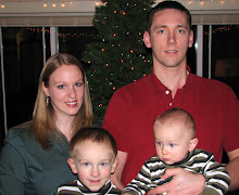
 I met Travis in Institute at Oregon State University in 2001 and we were married Aug 2002. We have 3 boys, Avery, Carson and Emmett. I love photography and run a business,
 Travis is a dentist at
 Avery was born in Dec 2004 and is now 7 and almost a 2st grader. He loves being a big brother to Carson and Emmett.
 Carson was born in March of 2007 and is now 5 years old.
 Emmett was born in September of 2008 and is now almost 4 years old.


5 comments:
That is such a cool business card! It looks fantastic!!!
LOVE it... we hate the business cards with an overload--this is perfect!
So exciting for travis to be so CLOSE to those three little letters that make the BIG difference. early congrats! :)
I like the fly after the word 'dental'
I like it!
You are so talented my friend!! Love it!!
Post a Comment